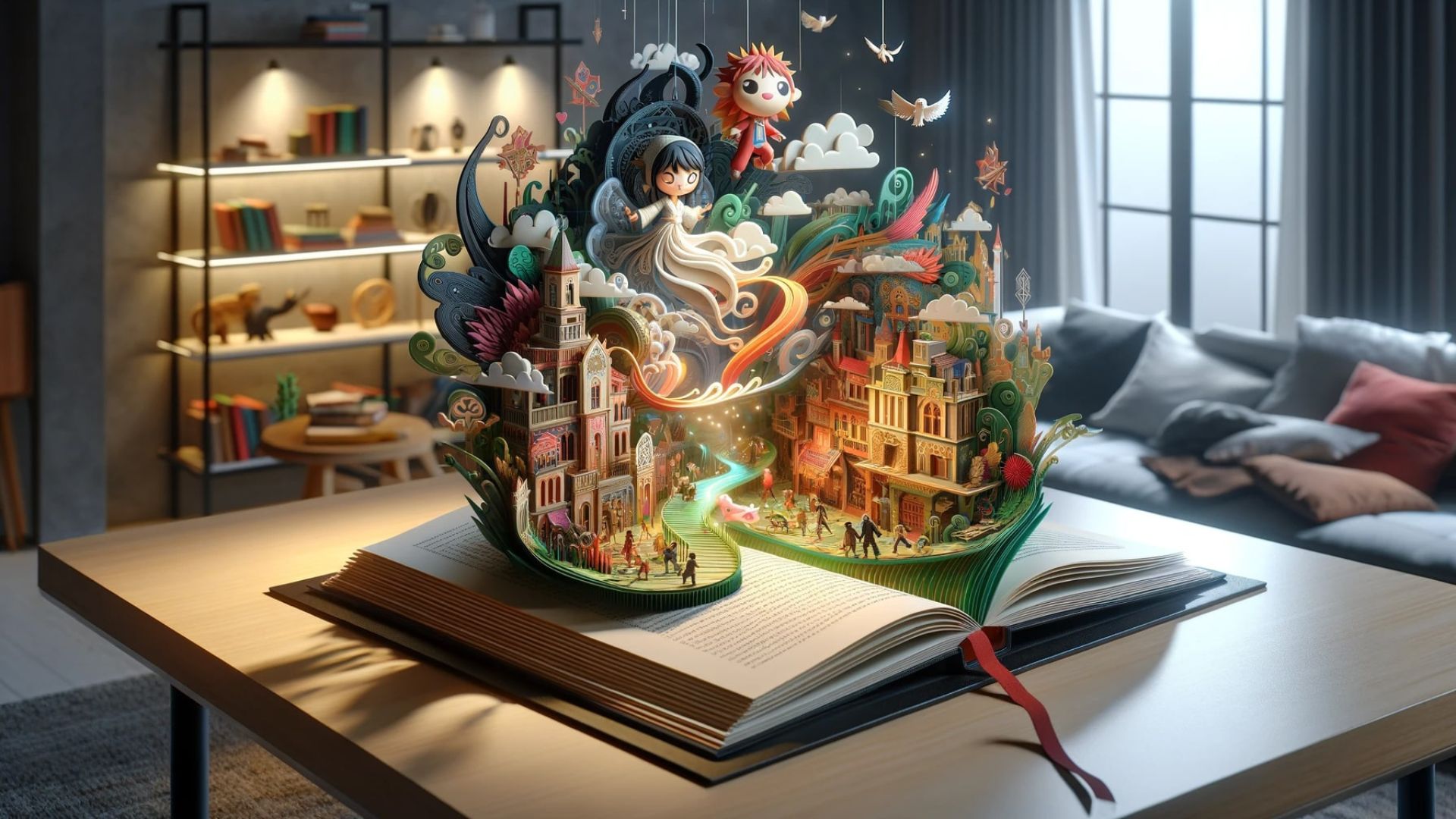
In today’s fast world, people scroll quickly and pay attention for only a few seconds. That’s why telling your story through visuals is so powerful. Visual storytelling uses images, design, and layout to help people understand your message fast—and remember it. Whether you’re a brand, a small business, or a content creator, using strong design helps your message connect in a way that words alone can’t.
Why Visuals Matter
Our brains process images faster than words. A photo, color, or layout can trigger emotions, create meaning, or grab attention almost instantly. This makes visuals a key part of how we tell stories online.
For example, think about an ad for a travel company. A picture of a sunset over the ocean tells a relaxing, dreamy story faster than any sentence could. That’s the power of design in action.
Design Sets the Tone
The design you choose affects how your audience feels. Clean, minimal design feels modern and professional. Bright colors and bold text can feel fun and exciting. Vintage styles give a feeling of nostalgia.
Before you create anything, ask yourself: What feeling do I want to share? Once you know, use colors, fonts, and images that match that mood. When design and story work together, your message becomes stronger.
Images Speak Louder Than Words
Great storytelling starts with strong visuals. Whether you use photos, icons, or drawings, each image should add meaning. Use images that support your message, not distract from it.
For example, if you’re sharing a post about climate action, a powerful photo of nature, people planting trees, or changing weather helps bring that message to life. It adds emotion and gives context to your words.
Color Sends a Message
Every color has a meaning. Blue can feel calm and trustworthy. Red can feel urgent or bold. Green often relates to nature or health. The colors you use in your story help shape how people feel about your message.
Pick a few brand colors and use them in all your designs. This builds recognition and makes your visual storytelling feel consistent. Using too many colors can confuse your viewer, so keep it simple.
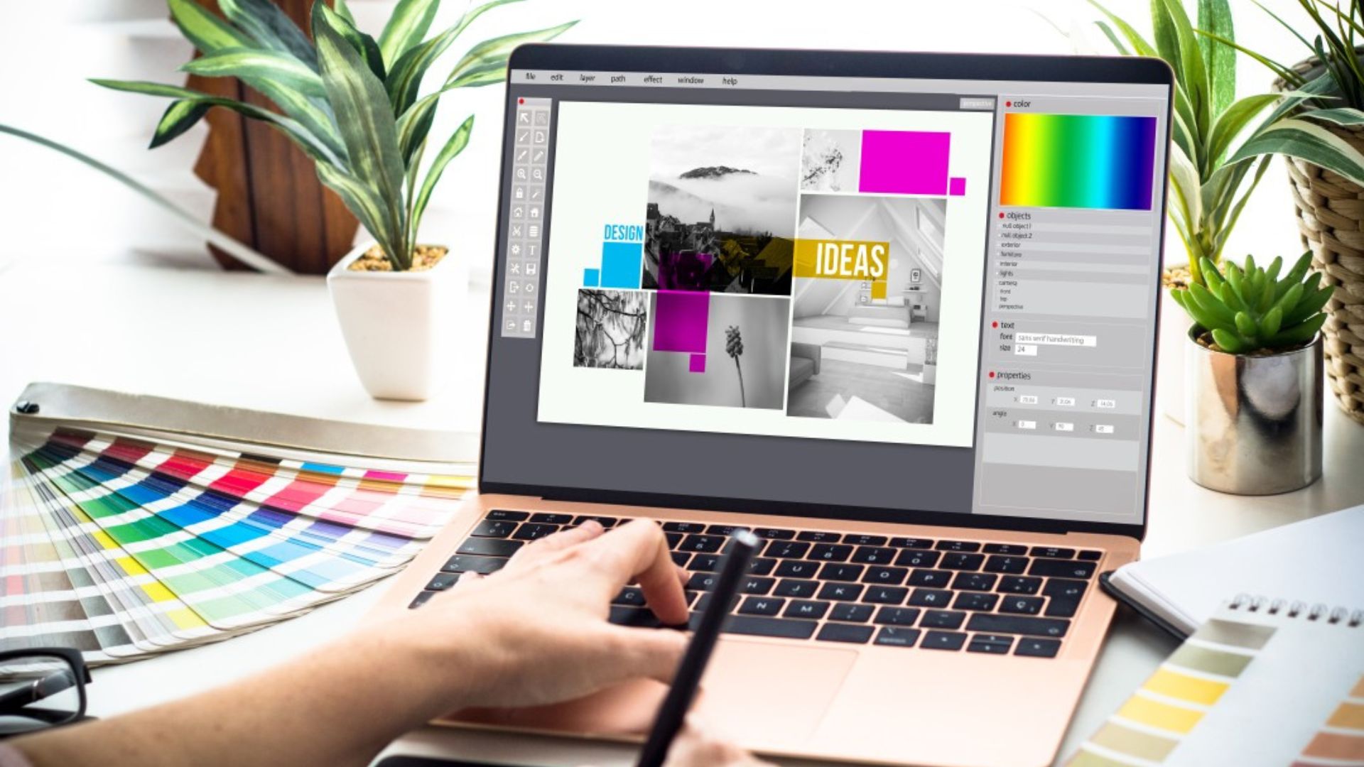
Typography Tells a Story Too
Fonts aren’t just about making text readable—they also add personality. A handwritten font might feel warm and friendly. A bold font might feel strong and modern. Choose fonts that match the mood of your message.
Use one or two fonts for your brand and stick with them. This helps your visuals look organized and easy to follow. Also, make sure your text is large enough to read on small screens like phones.
Layout Guides the Eye
Good layout helps people know where to look first. Use size, spacing, and design elements to lead the viewer through your story. Place your most important message or image at the top or center. Use white space to give your design room to breathe.
A messy layout can confuse people. A clean layout helps people focus. Keep things simple and let your story shine through the design.
Video and Motion Matter
Moving images can tell powerful stories. Even simple animations, like text sliding onto the screen, can add emotion and drama. Videos let you show more than a single photo ever could.
If you create content for social media, try using short videos or reels with clear messages. Add captions, brand colors, and consistent design elements to keep your story strong across all formats.
Conclusion
Visual storytelling isn’t just about making things look nice—it’s about helping your message reach people in a more powerful way. With the right mix of images, colors, fonts, and layout, you can create stories that stick. Whether you’re building a brand or sharing a post, good design shapes how your story is seen, felt, and remembered.