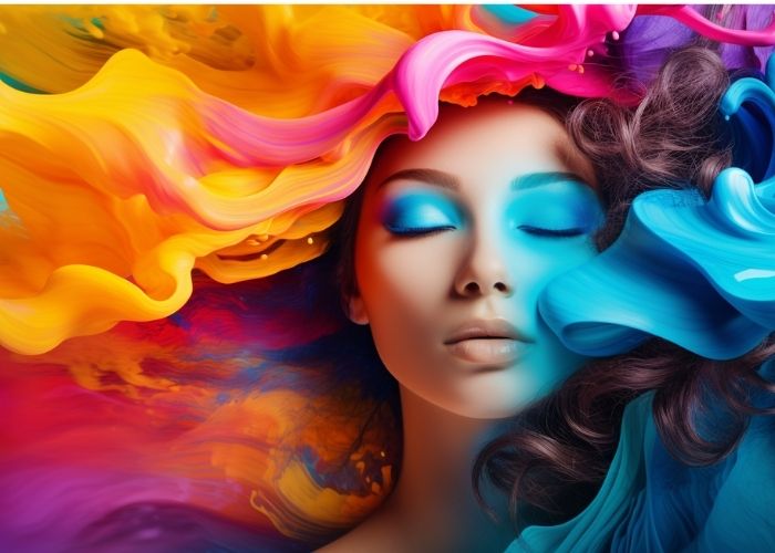
Color is more than just decoration. It shapes how users feel and behave. In web design, color psychology plays a major role. The right colors guide attention, create emotion, and even increase conversions.
Why Color Matters in Web Design
When visitors land on a site, they form opinions fast. Often, color is the first thing they notice. Studies show that color influences up to 90% of first impressions. So, choosing the right color palette is not just aesthetic—it’s strategic.
Understanding Color Psychology
Color psychology is the study of how colors affect thoughts and actions. Each color triggers a different emotional response. Web designers use this to influence users subtly. For example:
-
Red evokes urgency and excitement. It works well for sales or calls to action.
-
Blue builds trust. Many banks and tech firms use it.
-
Green suggests balance, health, and nature.
-
Yellow brings energy and optimism, but must be used in moderation.
-
Black stands for luxury and sophistication.
-
White creates a sense of space and cleanliness.
Building Brand Identity
Color helps define a brand. Think of Coca-Cola’s red or Facebook’s blue. Consistent use of brand colors builds recognition. It also conveys the brand’s personality. A playful site may use bright, vibrant colors. A luxury brand may go for dark, rich tones.
Enhancing User Experience
Colors impact how users navigate a site. A good designer uses color to guide actions. For example, contrasting colors on buttons make them stand out. That makes it easy for users to know where to click. Also, background and text colors should offer enough contrast to ensure readability.
Creating Emotional Connections
Every user brings emotion to their web experience. Colors help deepen that emotional link. For example, warm tones like red and orange can spark excitement. Cool tones like blue and green calm the mind. The goal is to match the site’s mood with the target audience’s expectations.

Cultural Considerations
Color meanings can change across cultures. In Western countries, white symbolizes purity. In some Eastern cultures, it represents mourning. Designers should always consider their audience. A global website may need color schemes that feel neutral and universal.
Improving Conversions
Color influences buying decisions. A well-placed red “Buy Now” button can lead to more clicks. But it’s not just about red. The best color depends on your audience and industry. A/B testing helps find which color combinations convert best. Smart designers always test before settling on one design.
Accessibility and Inclusivity
Not all users see color the same way. Some are colorblind. Others may have vision issues. So, designers must choose colors that everyone can read. Tools like contrast checkers ensure accessibility. Also, avoid using color as the only way to show information. Use shapes, icons, or labels too.
Consistency Across Devices
Colors may look different on various screens. Designers need to test websites on multiple devices. This ensures the color palette looks consistent and professional. Using web-safe colors and hex codes helps with this.
Final Thoughts
Color psychology is a powerful tool in web design. It affects how users think, feel, and act. The right colors build trust, guide actions, and boost results. But good design is more than just picking pretty shades. It’s about knowing your audience, testing your ideas, and creating a site that speaks through color. Use color wisely, and your website will not just look good—it will perform better too.


