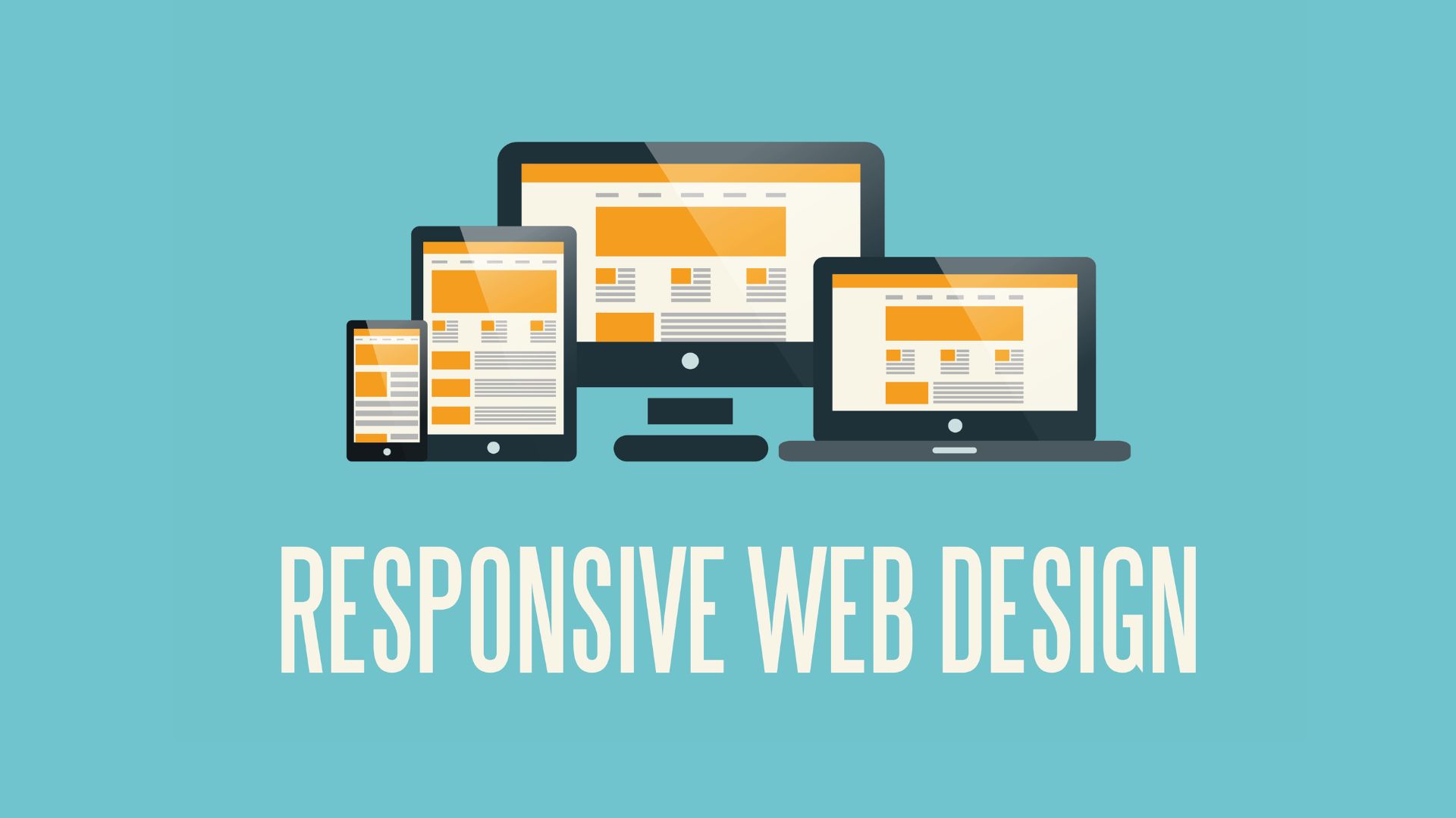
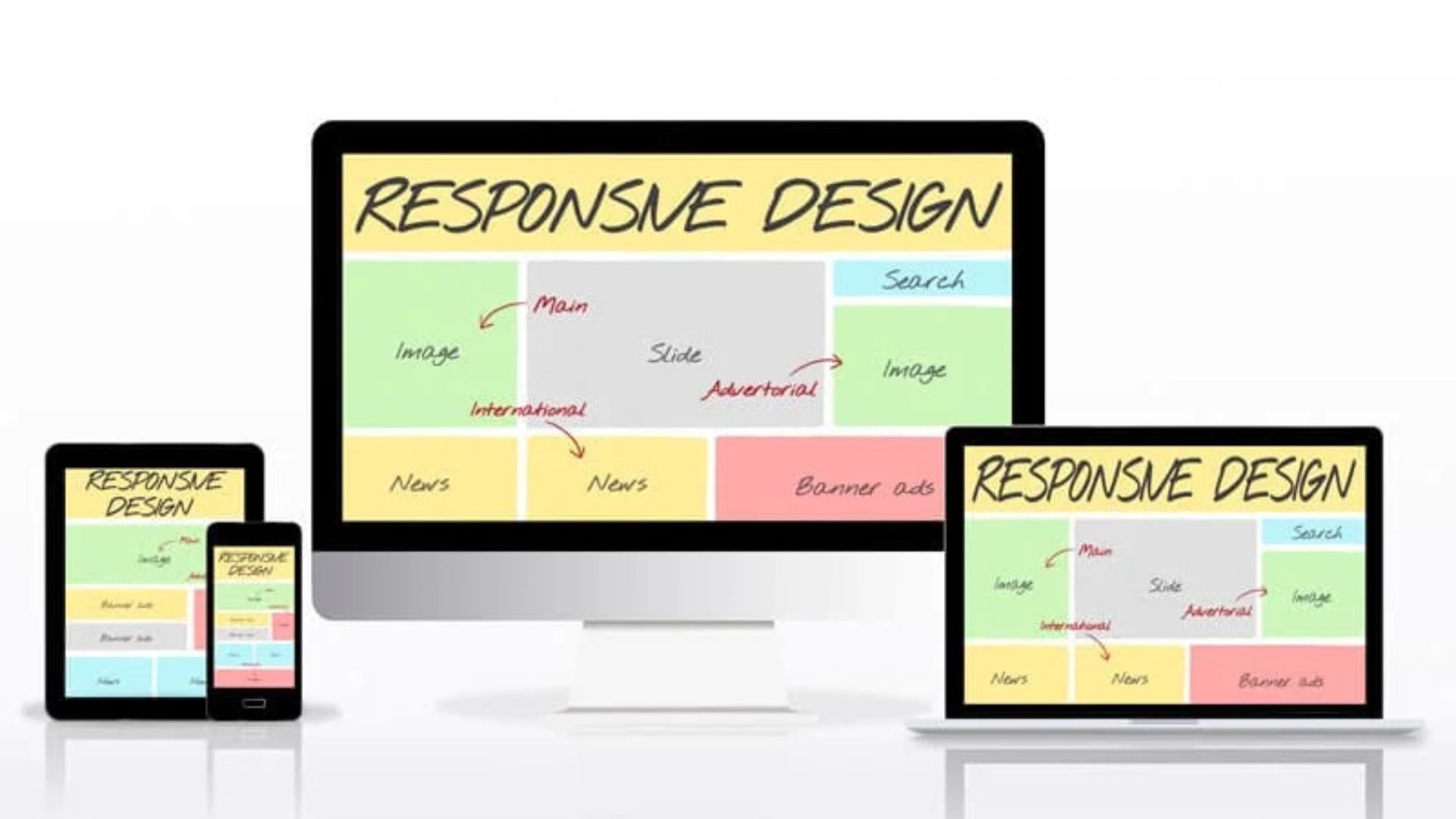
Responsive web design lets your site fit any screen. Today, people use phones, tablets, and laptops to browse. A site that looks good on all devices keeps visitors happy. Otherwise, users may leave. In this post, we explain responsive web design in very simple words. We also share why it is a must for every website.
What Is Responsive Web Design?
Responsive web design means your site changes its layout to fit the screen. On a desktop, you might see a full menu at the top. On a phone, that menu might hide behind an icon. This way, your content stays neat. The site adapts to any device. It uses flexible grids. It also uses images that scale and CSS rules.
As a result, users get a good experience on any device. Moreover, mobile-friendly design helps you keep only one site. You do not need separate mobile and desktop versions. This saves time and cuts costs.
Why Responsive Web Design Matters
First, many people now use mobile devices. If your site is not mobile-friendly, you lose visitors. Second, Google prefers mobile-friendly sites. With responsive web design, you rank higher in search results. Third, a responsive site is easier to manage. You only maintain one set of files. This saves time. It also saves money.
In addition, a better user experience leads to more sales. It also pulls in more leads. Furthermore, mobile mobile-friendly design keeps your brand consistent on all devices. That builds trust with your audience.
How Users Benefit from Responsive Web Design
When a user visits a responsive site, they do not need to zoom in. They do not need to scroll sideways. The text fits the screen. Buttons are easy to tap. Images resize on their own. Because of this, users stay longer. They view more pages. Therefore, the bounce rate drops.
For example, a customer shopping on a phone finds products quickly. They check out without frustration. Thus, mobile-friendly web design directly impacts your bottom line. In short, responsive web design makes life easier for your users. It also keeps them coming back.
Key Principles of Responsive Web Design
There are three main principles to follow. First, use flexible layouts. Instead of fixed widths, use percentages. This lets the site stretch or shrink as needed. Second, make images fluid. Use CSS rules so they scale with their containers. Third, apply media queries.
These rules change the design based on screen size. For example, at 600 pixels wide, hide the sidebar. At 900 pixels, show a multi-column layout. By combining these principles, you build a site that looks great on all screens. Moreover, mobile-friendly web design uses breakpoints at key widths. This ensures smooth transitions between layouts.
Tips for Implementing Responsive Web Design
Start by choosing a framework that supports mobile-first design. Popular options include Bootstrap and Foundation. These frameworks have built-in grids that adjust automatically. They help you design faster. Next, test your site on real devices. You can also use browser tools to simulate various screen sizes. Moreover, keep your design simple. Avoid too many elements that crowd the screen on small devices. Also, prioritize content.
Show the most important items first. For example, place call-to-action buttons near the top on mobile. In addition, optimize images by compressing them. Smaller files load faster on any device. Finally, check your site’s performance often. Use tools like Google PageSpeed Insights to spot issues and fix them.
Common Mistakes to Avoid in Responsive Web Design
One mistake is using fixed-width layouts. These do not adapt to different screens. They break mobile-friendly design. Second, some designers hide key content on mobile. This frustrates users. Instead, hide only non-essential items. Third, people often forget to test on tablets. They test only on phones and desktops. Yet, tablets have varied screen sizes, too.
Always include tablet testing. Another mistake is oversized images. Large files can slow load times. They hurt mobile-friendly design. Use responsive image tags to serve smaller files on mobile. Lastly, avoid text that is too small on small screens. Always check readability and font size. Additionally, avoid long paragraphs without breaks. Short text blocks help mobile users read more easily.
SEO Benefits of Responsive Web Design
Google uses mobile-first indexing. It looks at the mobile version of your site first. If your mobile site uses a mobile-friendly design, you rank better. Furthermore, having one URL for all devices avoids duplicate content issues. This simplifies your SEO strategy. Also, faster load times improve user signals. For instance, users stay longer on fast sites.
They click more pages. This tells Google your content is valuable. In contrast, slow sites get punished in search rankings. Therefore, investing in responsive web design pays off in SEO and user engagement. Finally, responsive web design boosts social sharing and link building. It makes your content accessible everywhere.
Future Trends and Responsive Web Design
The web keeps changing. New devices keep appearing, such as foldable phones or wearables. With mobile mobile-friendly design, your site will adapt to these screens. In addition, designers now use fluid typography and CSS grid layouts. These methods go beyond simple percentages.
They let you build more flexible designs. Also, frameworks keep updating with new features. By staying current, you ensure your site remains responsive. Moreover, as voice assistants and smart TVs grow, your responsive site can serve those platforms too. In short, mobile-friendly design is not a one-time fix. It is an ongoing commitment to adapt to new technology.
Conclusion
Responsive web design is essential in today’s digital world. It ensures your site looks good on any device. It keeps users happy and boosts SEO. By using flexible layouts, fluid images, and media queries, you create a site that adapts to all screens. Remember to test on multiple devices and optimize for speed.
Avoid common pitfalls like fixed layouts and hidden content. Finally, stay updated with new techniques and tools. With these simple steps, you can embrace mobile mobile-friendly design. In doing so, you provide a better experience for your visitors. You also improve your online presence. Therefore, do not wait—make your website responsive today.