
Fonts and colors may appear to be minor details on a website, but they have a significant impact on how users feel and interact. In modern web design, every detail is important. From the shape of a letter to the color of a button, these elements make the first impression and influence user behaviour.
Let’s look at how fonts and colors influence today’s websites, as well as how they contribute to a clean, appealing, and effective user interface design (UI).
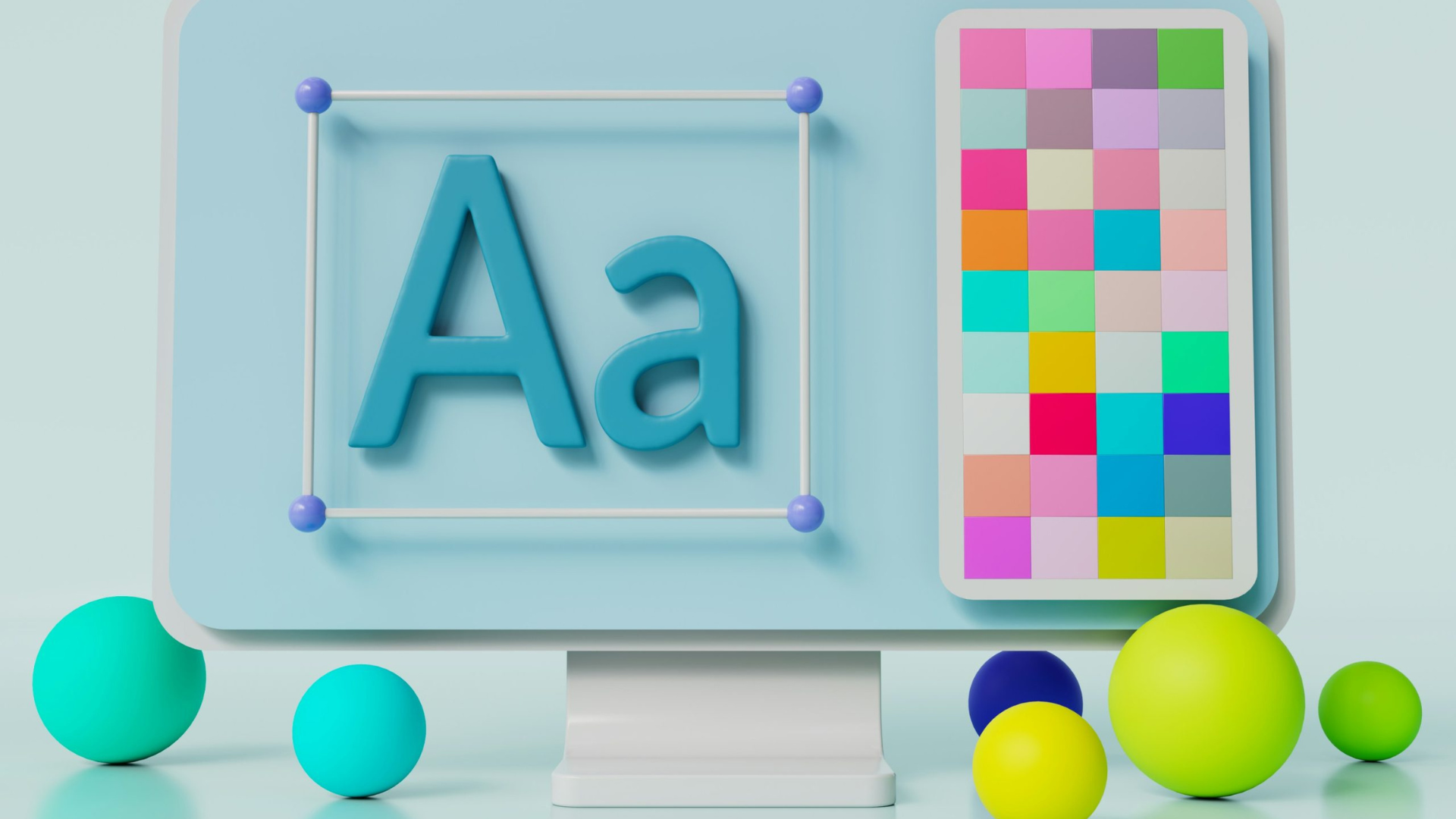
Why Fonts Are Important in Modern Web Design
Typography does more than display words—it sets the tone. The right font makes your message clear and supports your brand. In contemporary web design, fonts need to be readable, accessible, and responsive.
For example, a bold sans-serif font can make a site feel modern and strong. On the other hand, a soft serif font may make it feel elegant or traditional. Therefore, font choice is not just a style decision—it’s a part of your communication strategy.
In progressive web design, designers often use system fonts or web-safe fonts to ensure fast loading and a clean appearance across devices. As a result, users get a sleek digital experience design without delays or display errors.
The Importance of Color in Current Web Aesthetics
Colors speak louder than words. They trigger emotions and help guide users. In modern web design, color palettes are carefully selected to reflect the brand’s mood and purpose.
For instance:
- Blue often represents trust and professionalism.
- Red shows energy or urgency.
- Green connects to health or nature.
Furthermore, high contrast between text and background increases readability. This is critical for user-centred interface design, particularly for those with visual impairments.
Colour can also highlight important actions, such as “Buy Now” buttons or form fields. When used properly, colours create a responsive and adaptive design that allows users to navigate the site naturally.
Fonts and Colours for Responsive and Adaptive Design
In today’s mobile-first world, your fonts and colours must be legible at all screen sizes. A perfect font on a desktop may appear too small on a smartphone. Similarly, a soft colour on a large screen may be difficult to read on a smaller device.
That’s why responsive and adaptive design are essential. Modern tools enable designers to change the font size, line height, and colour contrast for different devices. This results in a cutting-edge web presence that appears seamless and professional across all platforms.
Combining Fonts and Colors for a Strong First Impression
Together, fonts and colors build trust and guide action. When users land on a website, they decide within seconds whether to stay or leave. A smart mix of readable fonts and appealing colors helps keep them engaged.
In cutting-edge web development, designers test different combinations using real data. They may run A/B tests to see which fonts or color schemes perform better. This approach not only improves contemporary web design but also ensures the site meets its goals.
Tips for Designers:
- Use a maximum of two or three font families.
- Keep your colour scheme simple and clean.
- Ensure that your text contrasts well with the background.
- Test your design on different screen sizes and devices.
Conclusion
In conclusion, the power of fonts and colors in modern web design is hard to overstate. They shape your message, guide your visitors, and support a smooth, stylish experience. Whether you focus on current web aesthetics or aim for a cutting-edge web presence, the right visual choices make all the difference. By understanding the role of typography and color, you’ll create a more powerful, effective website—one that not only looks good but also functions well.