In today’s world, people use their phones more than ever to go online. Whether it’s checking emails, shopping, watching videos, or reading news, mobile devices are often the first screen we reach for. This shift means websites need to work great on phones—not just desktops. That’s where mobile-first web design comes in.
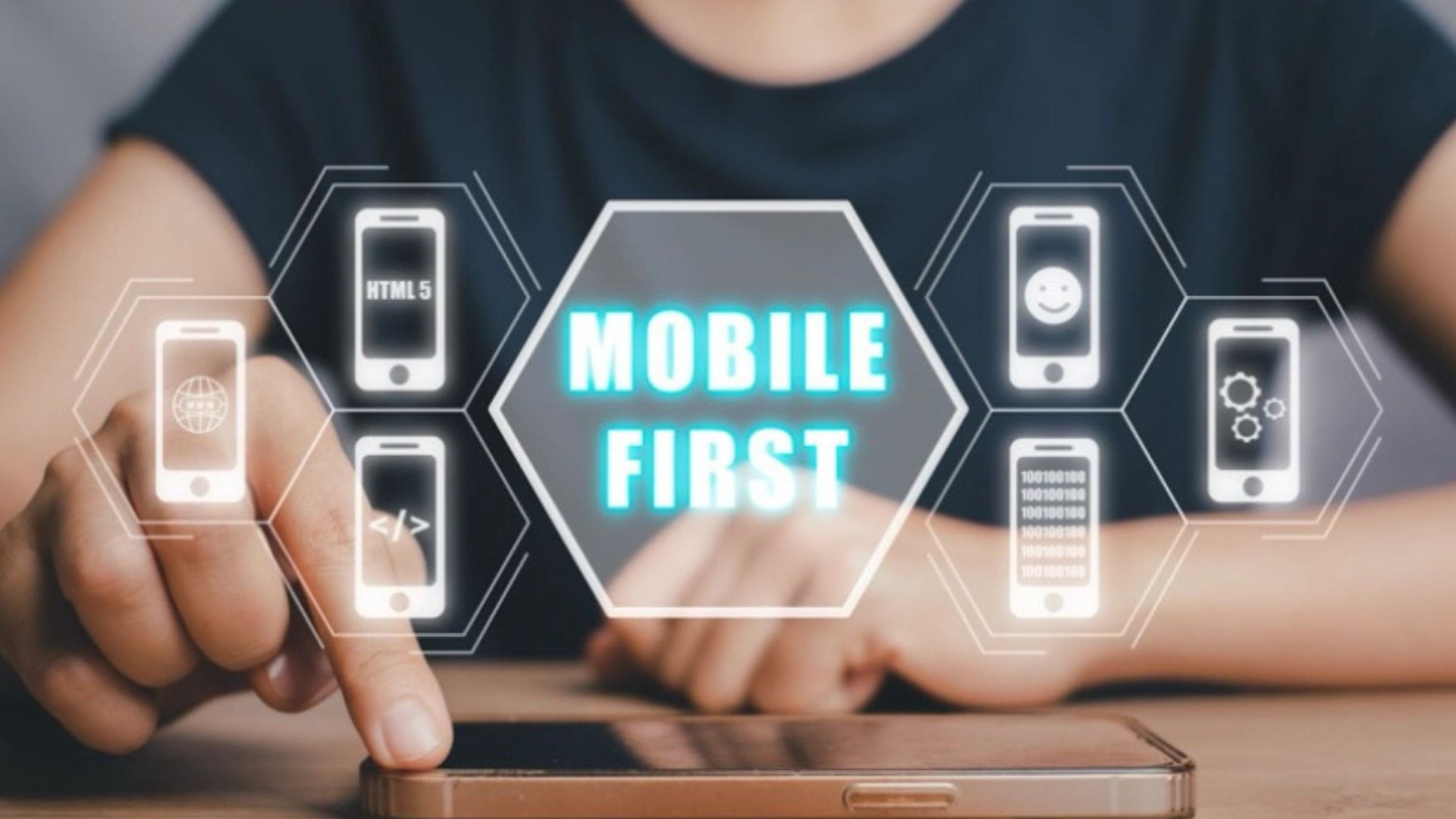
Mobile-first web design means you start designing your website for small screens first. Then, you build up from there for larger screens like tablets and desktops. It’s no longer just a trend—it’s a must for anyone who wants to stay visible and competitive online.

Why Mobile-First Matters Today
More than half of all internet traffic now comes from mobile devices. That means if your site doesn’t work well on a phone, you’re missing out on a huge number of users. People expect pages to load fast, look good, and be easy to use on their phones. If your site fails at that, they’ll leave.
Google also pays attention. Its search engine ranks mobile-friendly sites higher. If your website isn’t designed with mobile in mind, it could lose out on valuable search traffic.
Speed Is Key on Mobile
One of the biggest reasons users leave a mobile site is slow loading time. If a page takes more than a few seconds to load, people get frustrated and tap away. Mobile-first design helps avoid this by keeping things light. Images are sized correctly, scripts are smaller, and design elements are clean and fast.
When you build your site with mobile in mind, speed becomes a natural part of the process. This improves not only user experience but also your search engine rankings.
Simplicity Improves Usability
On a small screen, space is limited. You don’t have room for clutter. Mobile-first design forces you to focus on what really matters. The layout is simple, the buttons are big enough to tap, and the content is easy to read.
When your site works well on mobile, it’s usually better on desktop too. That’s because the design becomes clear, focused, and easy to use on any device.
Navigation Should Be Thumb-Friendly
Think about how people hold their phones—with one hand and one thumb. A mobile-first website puts important buttons and menus where they’re easy to reach. Navigation is simple, with no tiny links or hidden features.
This improves the overall experience and makes it more likely users will explore your site instead of leaving.
Design From Small to Large
Old methods often started with desktop design and tried to shrink it for mobile later. But that approach doesn’t work anymore. When you build from mobile up, your website stays clean and easy to scale.
Start by making sure your site looks and works perfectly on a phone. Then add more features as the screen size grows. This way everyone has access no matter what device they use.
Content Must Be Easy to Read
Tiny text and long paragraphs won’t keep anyone’s attention on mobile. With a mobile-first mindset, content is written to be quick to read. Use short sentences, clear headings, and natural breaks. People often scan rather than read word-for-word, so your content should guide them smoothly through the page.
Better Results With Mobile-First
When your website feels fast, clean, and helpful on a phone, people stay longer. They’re more likely to click, buy, or subscribe. That means better results for your business or brand.
A mobile-first website also builds trust. It shows you care about your visitors’ time and comfort. In return, they’re more likely to come back.
Conclusion
Mobile-first design isn’t just a smart idea anymore—it’s a requirement. People expect websites to work smoothly on their phones. If yours doesn’t, you’re likely losing visitors and search rankings. By focusing on speed, simplicity, and mobile usability, you can create a site that works for everyone—no matter what screen they use.