Every brand needs to look good to stand out. That’s where graphic design tips comes in. From your logo to your website, the way your brand looks can say a lot. Great design helps people trust you, remember you, and understand what you do. If you’re just starting out or want to improve your brand, these graphic design basics will help you look more professional and connect with your audience.

Start with a Strong Logo
Your logo is the face of your brand. It should be simple, easy to remember, and show what your business stands for. Think about how it looks in black and white, in small sizes, and on different backgrounds. A good logo works everywhere—from business cards to websites and social media.
If you’re not a designer, consider hiring one or using tools like Canva or Looka. Avoid copying other logos. Make sure yours feels original and fits your brand’s voice.
Choose the Right Colors
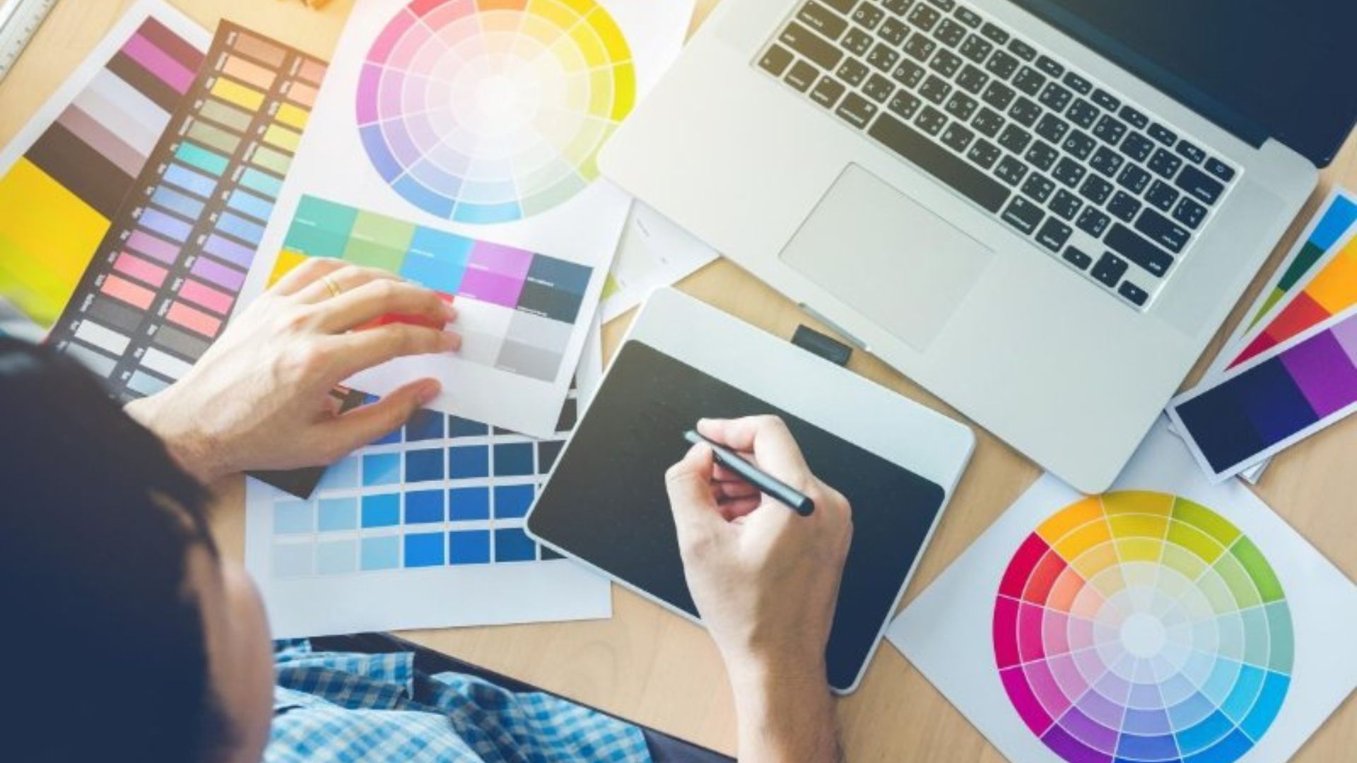
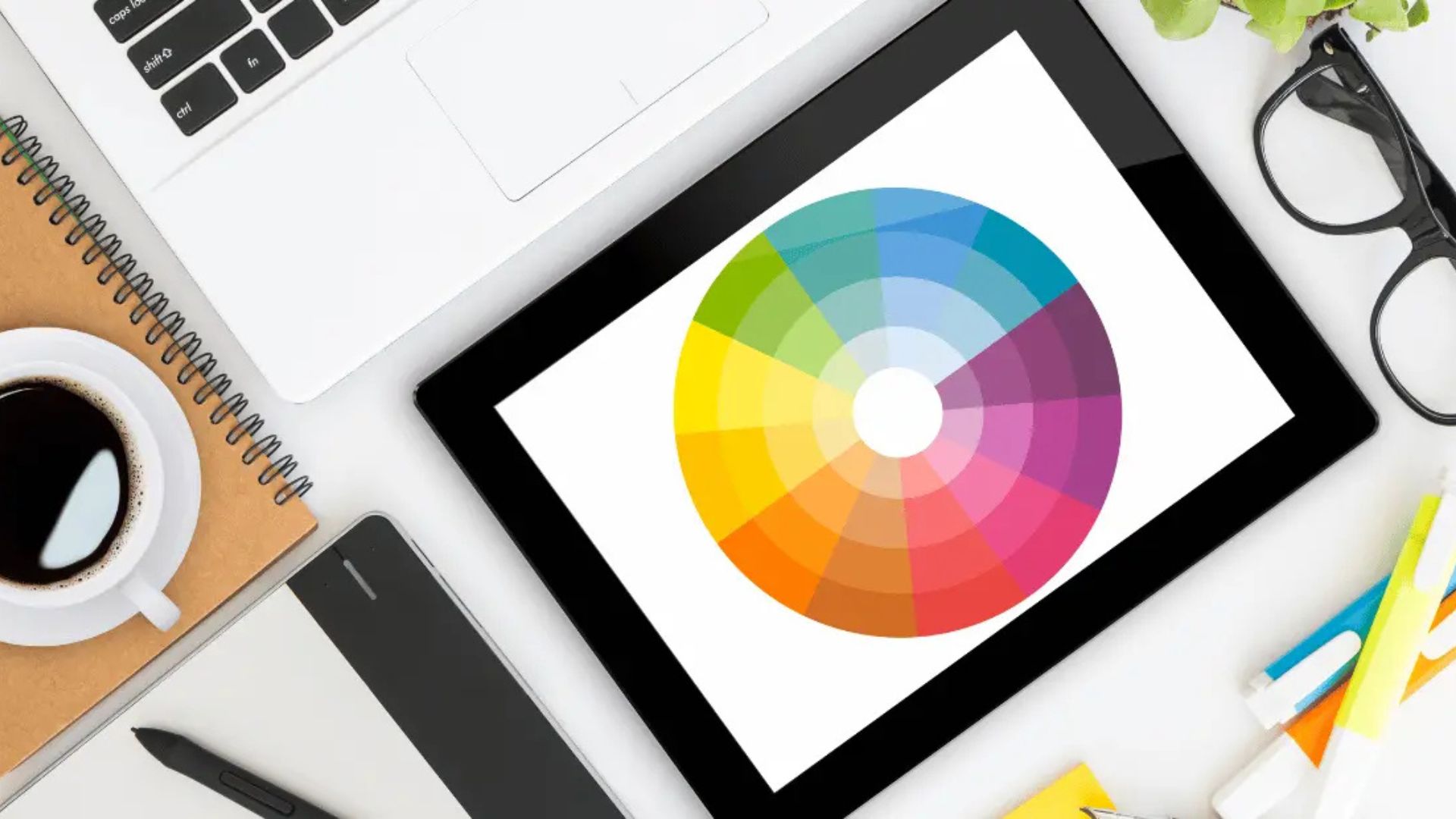
Colors can make people feel a certain way. For example, blue often feels calm and professional, while red feels bold and exciting. Choose a color palette that matches your brand personality. Use no more than three main colors to keep things clean and consistent.
Stick with the same colors across your logo, website, social media posts, and ads. This helps people recognize your brand at a glance.
Pick a Readable Font
Fonts matter more than you think. The wrong font can make your message hard to read or feel off-brand. Stick to simple, clear fonts that are easy to read on phones and computers. Use one or two fonts at most—one for headings and one for body text.
Fonts should also match your brand vibe. A law firm might use a classic serif font, while a kids’ toy brand could use a playful, round font. Always keep readability in mind.
Use Consistent Layouts
Consistency makes your brand look polished. Whether it’s a flyer, a social media post, or a webpage, use the same layout rules. That means keeping things aligned, spacing elements evenly, and repeating the same visual patterns.
Templates can help with this. Create branded templates for Instagram posts, blog graphics, and presentations. It saves time and keeps your content on-brand.
Less Is More
Don’t clutter your designs with too many colors, images, or words. Keep it clean. Good design leaves space around important elements, so they stand out. That’s called “white space,” and it helps your content breathe.
Make sure your message is clear at first glance. People online scroll fast—if they don’t understand your design in a few seconds, they’ll move on.
Use High-Quality Images
Blurry or stretched images can make your brand look unprofessional. Always use clear, high-resolution images. Whether you’re using photos or illustrations, make sure they match your brand style and color scheme.
If you don’t have your own images, use royalty-free ones from sites like Unsplash or Pexels. And remember—never use images you don’t have permission for.
Design for Mobile First
Most people will see your content on a phone, not a computer. So your design should look good on small screens. That means using large text, simple layouts, and buttons that are easy to tap. Test your designs on a phone before you post or publish.
Keep Evolving Your Look
Design trends change, and so do people’s tastes. While it’s good to stay consistent, it’s also smart to update your look from time to time. Maybe it’s a logo refresh, a new color shade, or updated font styles. Small changes can keep your brand feeling fresh while staying true to your core identity.
Conclusion
Great graphic design helps your brand speak clearly and confidently. By learning the basics—like choosing colors, picking the right fonts, and keeping things clean—you can build trust and grow your audience. You don’t have to be a pro to get started. Use these tips to create designs that show the best version of your brand, one post or project at a time.


