Choosing the right colors can make or break a design. Whether you’re creating a logo, website, or poster, the colors you pick affect how people feel and react. This is where color theory comes in. In this guide, you’ll learn the basics of color theory and how to choose the best color palette for any project.
What Is Color Theory?
Color theory is the science and art of using colors. It explains how colors mix, match, and contrast with each other. By understanding how colors work together, you can create better, more effective designs.
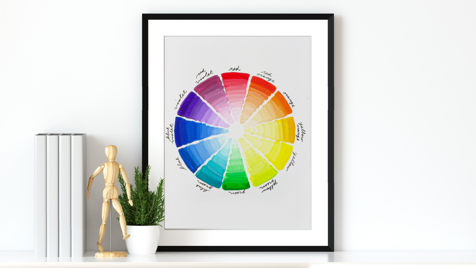
Color theory is based on the color wheel, which shows the relationship between primary, secondary, and tertiary colors.
-
Primary colors: Red, blue, yellow
-
Secondary colors: Orange, green, purple (made by mixing primary colors)
-
Tertiary colors: Made by mixing primary and secondary colors
Why Color Choice Matters
Colors can trigger emotions and send messages. For example:
-
Red feels bold and energetic.
-
Blue is calm and trustworthy.
-
Yellow feels happy and friendly.
So, choosing the right color palette helps your design speak the right language.
How to Choose the Right Color Palette
Picking a color palette might seem hard, but it becomes easier with a few simple tips.
1. Understand Your Brand or Message
Before you choose any colors, think about what your design needs to say. Is it playful, serious, modern, or vintage? Your color palette should match the tone and purpose.
For example:
-
A tech company might use cool blues and grays.
-
A kids’ brand might go for bright yellows and reds.
2. Start with a Base Color
Pick one main color that represents the feeling or message you want. This will be the starting point for your palette. From there, build around it using matching or contrasting colors.
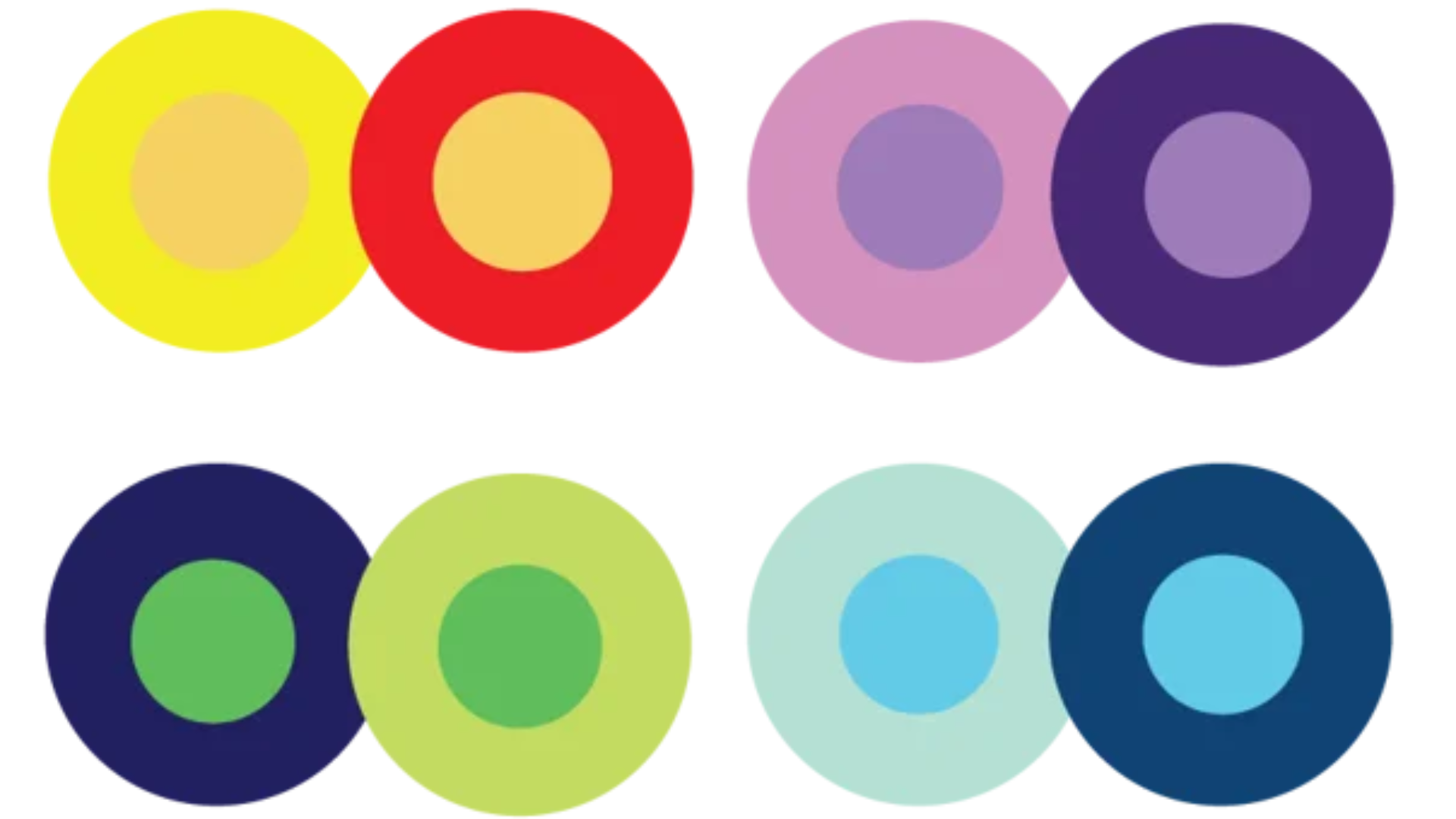
3. Use Color Harmonies
Color harmonies are groups of colors that look good together. Based on the color wheel, here are some useful types:
1. Complementary: Colors opposite each other (e.g., blue and orange). High contrast and attention-grabbing.
2. Analogous: Colors next to each other (e.g., green, lime, and yellow). Soft and harmonious.
3.Triadic: three colors evenly spaced (e.g., red, blue, and yellow). Balanced and vibrant.
These harmonies help you make smart choices that look professional.
4. Limit Your Palette
If you use too many colors, your design may appear cluttered. Limit your color scheme to three to five primary hues, with the remaining hues being used for backgrounds and accents.
5. Consider Accessibility
Not everyone sees color the same way. Make sure your palette works for people with color vision issues. Use contrast checkers online to ensure your text is easy to read.
6. Use Tools to Help
There are many free tools to help you build your palette:
-
Adobe Color
-
Coolors.co
-
Canva’s color wheel
These tools let you play with combinations and find palettes that look great together.
Final Thoughts
Understanding color theory helps you choose colors that not only look good but also make people feel the right way. With a few simple tips and a little practice, you’ll be able to create stunning color palettes for any design project.
So next time you’re starting a new design, take a moment to think about your colors. The right palette can truly bring your vision to life.