Colors are more powerful than most people realize. In web design, colors don’t just make your site look pretty—they also influence how visitors feel, think, and act. This is called color psychology, and it plays a big role in how users interact with your website.
What Is Color Psychology?
Color psychology is the study of how colors affect people’s behavior. Different colors can make people feel calm, excited, happy, or even hungry. In web design, the colors you choose can guide users, create trust, and help you send the right message.
For example, blue often represents trust and stability, which is why many banks and tech companies use it. Red can create urgency, which is great for sales or limited-time offers. Understanding these meanings can help you design a website that connects with your audience.
Why Color Matters in Web Design
When someone visits your website, they form an opinion in seconds. Color plays a big role in that first impression. If your site looks too dark or too bright, users might leave quickly. But if you use the right color mix, visitors are more likely to stay, read, and take action.
Colors help with:
-
Brand identity: Colors make your brand stand out. Think about Coca-Cola’s red or Facebook’s blue.
-
User experience: A good color scheme makes the site easy to read and navigate.
-
Conversions: Smart color choices can lead people to click buttons, sign up, or make a purchase.
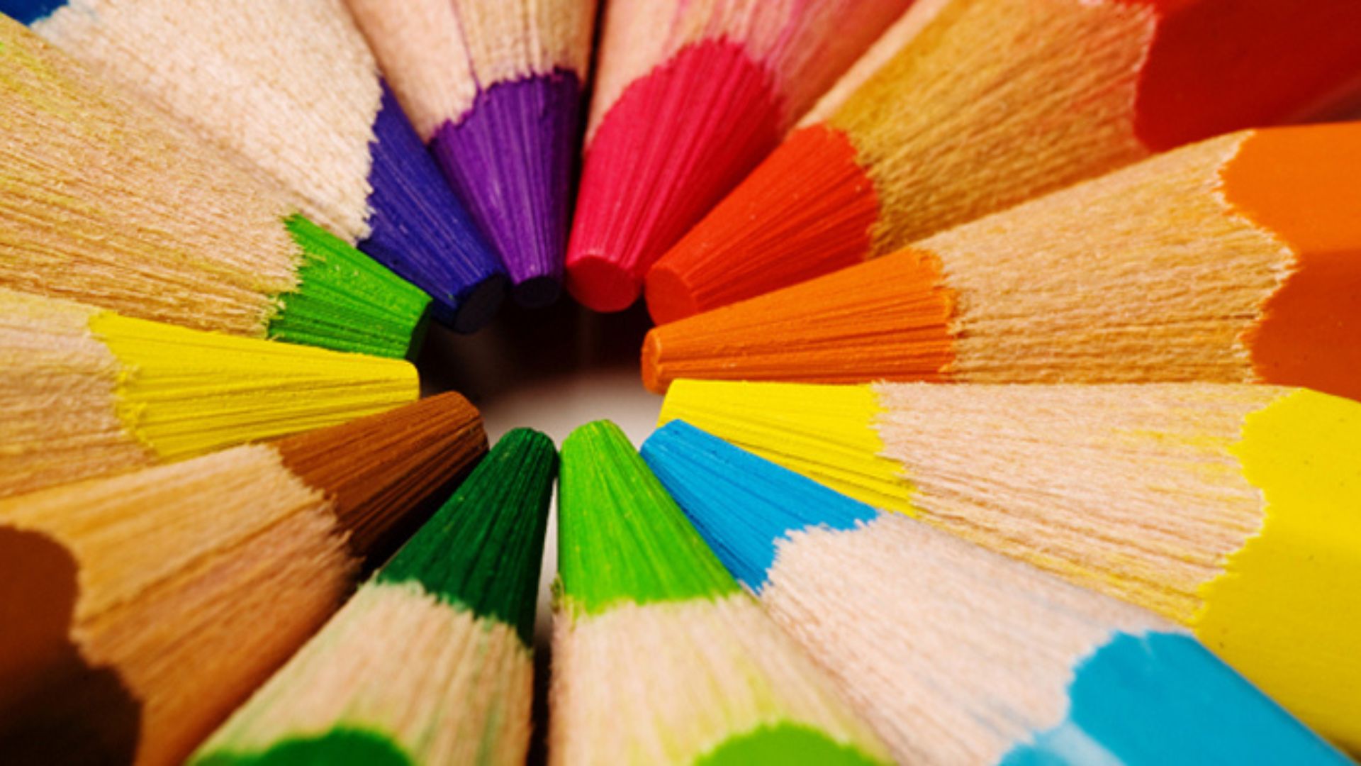
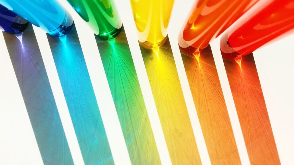
Common Colors and What They Say
Here’s a breakdown of popular colors and the feelings they usually create:
-
Red: Energy, urgency, excitement. Great for sales buttons or alerts.
-
Blue: Trust, calm, professionalism. Ideal for banks, tech, and corporate sites.
-
Green: Nature, growth, health. Common for environmental or wellness brands.
-
Yellow: Happiness, optimism, attention. Works well for kids’ products or promotions.
-
Orange: Fun, confidence, friendliness. Good for call-to-action buttons.
-
Purple: Luxury, creativity, wisdom. Often used in beauty and creative industries.
-
Black: Power, elegance, sophistication. Best for luxury or fashion brands.
-
White: Cleanliness, simplicity, space. Perfect for minimalist designs.
-
Gray: Balance, neutrality, modern style. Good as a background or accent.
How to Choose the Right Color for Your Website
Start by thinking about your brand and your audience. What feeling do you want to give your visitors? What actions do you want them to take?
If you’re a lawyer or a financial advisor, blue or gray may work best because they create trust. If you sell fun products for kids, bright colors like yellow, orange, or green can be more engaging.
It’s also important to match your color scheme with your logo and branding. Your website should feel like a natural extension of your brand, not something completely different.
Using Color for Better User Experience
Color doesn’t just create emotion—it also guides the user’s journey on your site. You can use color to highlight important parts, show where to click, or break up long sections of text.
Here are some tips for using color in web design:
-
Highlight CTAs (Call-To-Action): Make your “Buy Now” or “Sign Up” buttons stand out with bold colors like red, orange, or green.
-
Keep text readable: Use dark text on a light background or vice versa. Avoid light gray on white—it’s hard to read.
-
Stick to a color palette: Don’t use too many colors. Choose 2–3 main colors and use them consistently.
-
Use white space: Don’t fill every inch of your page. White space helps your content breathe and keeps the site clean.
Color and Accessibility
Make sure your colors work for everyone. Not all users see colors the same way. Some may have color blindness or other visual issues. You can improve accessibility by:
-
Using high contrast between text and background
-
Adding labels or icons, not just relying on color to show meaning
-
Testing your design with accessibility tools like WebAIM or contrast checkers
A site that’s accessible to all users is not only more inclusive—it also performs better in SEO and user satisfaction.
Testing and Adjusting Your Color Choices
Even with all the research, sometimes you need to test to find what works best. Try A/B testing different button colors to see which ones get more clicks. You might find that a green button works better than blue, or that a softer tone keeps users on the page longer.
Conclusion
Color psychology is more than just a design trend—it’s a tool that helps you create better websites. When you understand what colors say, you can build a website that feels right, works better, and keeps visitors coming back.