Have you ever opened a website on your phone and had to zoom in just to read the text or click a tiny button? It’s annoying, right? That happens when a website isn’t responsive. Today, people visit websites using all kinds of devices—phones, tablets, laptops, and even smart TVs. That’s why responsive web development is more important than ever. It makes sure a website works well and looks good on any screen, no matter the size. Let’s take a closer look at what responsive web development means and why it matters so much now.
What Is Responsive Web Development?
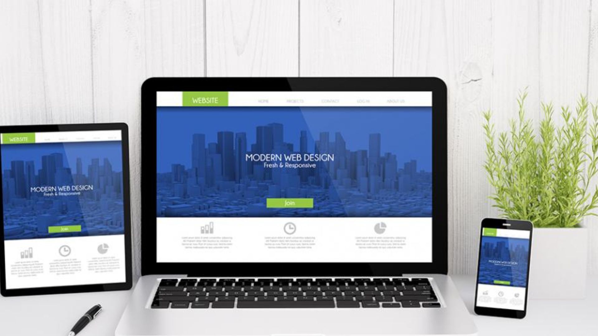
Responsive web development is the process of building websites that adapt to different screen sizes. A responsive website automatically adjusts its layout, images, and text so everything stays easy to see and use—whether you’re on a desktop or a smartphone.
Instead of creating separate websites for each device, developers build one site that changes based on the screen. This makes it easier to manage and better for users.
Why It Matters in Today’s World
1. People Use Mobile Devices More Than Ever
These days, most people browse the internet on their phones. Whether it’s checking social media, shopping, or reading the news, mobile use keeps growing. If your site isn’t mobile-friendly, you risk losing a huge number of visitors.
Responsive websites make it easy for users to scroll, read, and click on things without struggling. A smooth mobile experience helps keep people on your site longer.
2. Better User Experience Builds Trust
Imagine clicking on a website that looks messy on your phone. You might leave right away, thinking it’s outdated or unprofessional. A clean, easy-to-use design makes people feel comfortable. It also shows that your brand cares about quality.
When users have a good experience, they’re more likely to come back or recommend your site to others.
3. Search Engines Prefer Responsive Sites
Search engines like Google rank websites based on how useful and user-friendly they are. If your website works well on mobile devices, it’s more likely to appear higher in search results.
This means responsive design can help your site get more visitors. It supports your SEO strategy and makes your site easier to find online.
4. Faster Load Times on All Devices
Responsive websites are built to load quickly, even on slow mobile connections. When a website takes too long to load, users leave. Fast-loading pages improve user experience and can reduce bounce rates.
Developers use techniques like compressing images and avoiding large files to make responsive sites fast and smooth.
5. Easier to Manage and Update
With a responsive website, you only have to manage one version of your site. That saves time and reduces confusion. Instead of making changes for each device separately, updates apply across all screen sizes.
This also makes testing easier. Developers can check how the site looks and works using different screen simulations without building extra pages.
6. Supports Future Devices
Responsive design isn’t just for phones and laptops—it helps your website work on devices that haven’t even come out yet. As new screen sizes are released, your website will already be ready to adapt.
That makes responsive web development a smart long-term investment.
Conclusion
Responsive web development isn’t just a trend—it’s a must in today’s digital world. With more people browsing on phones and tablets, websites need to keep up. A responsive site offers better user experience, stronger SEO, and easier management. Plus, it builds trust with your audience.
If you’re building a website or updating an old one, make sure it’s responsive. It’s one of the best ways to reach more people and grow online.